LOADING
(0%)
PF FV 2026








Michi Bistro


(006)
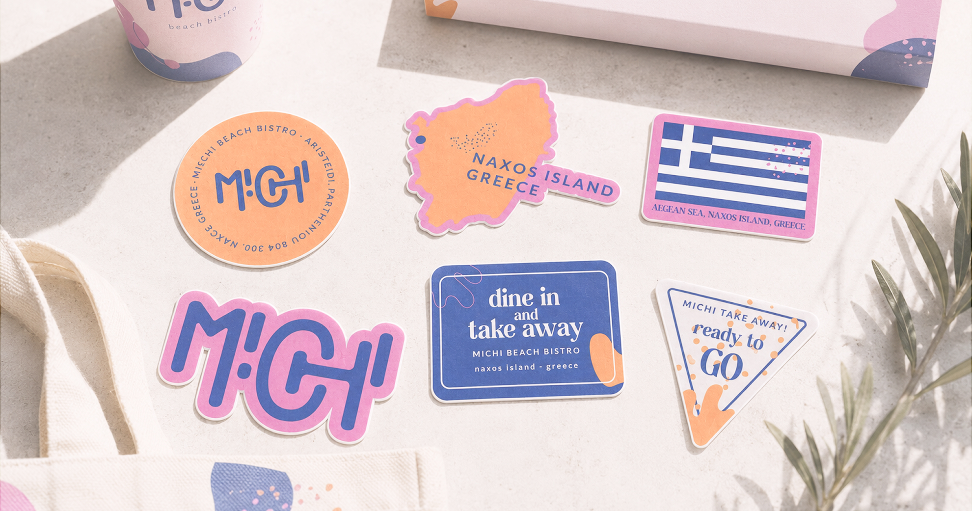
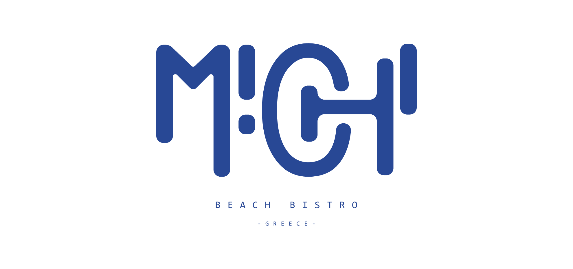
Michi is a branding exploration for a fictional beachside bistro. Built with playful shapes, soft colors, and oversized typography, the identity balances simplicity and character. The result is a visual system that feels relaxed, distinctive, and full of personality without ever taking attention away from the products themselves.

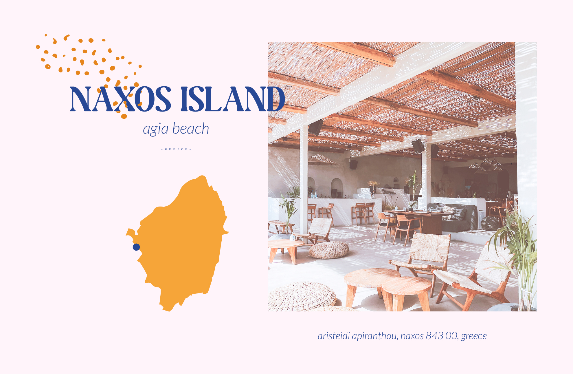
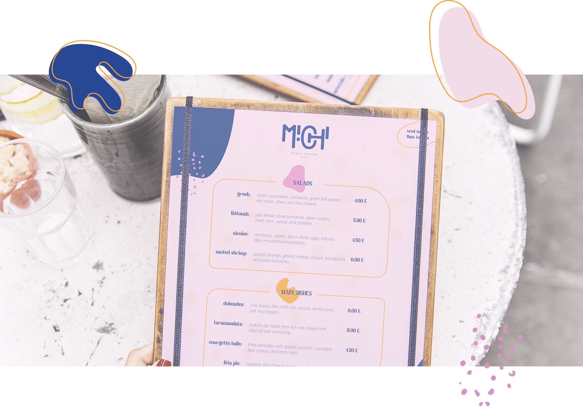
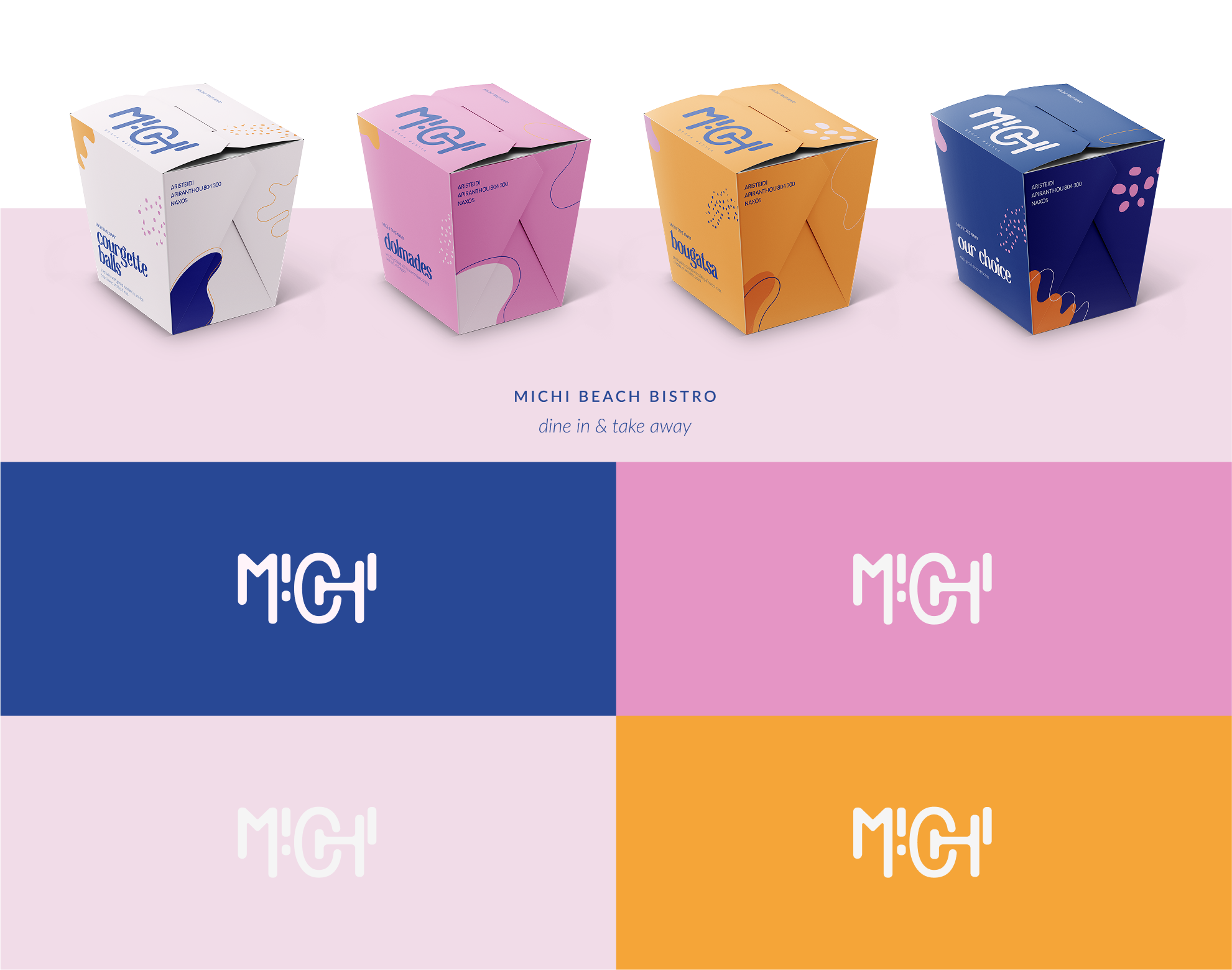
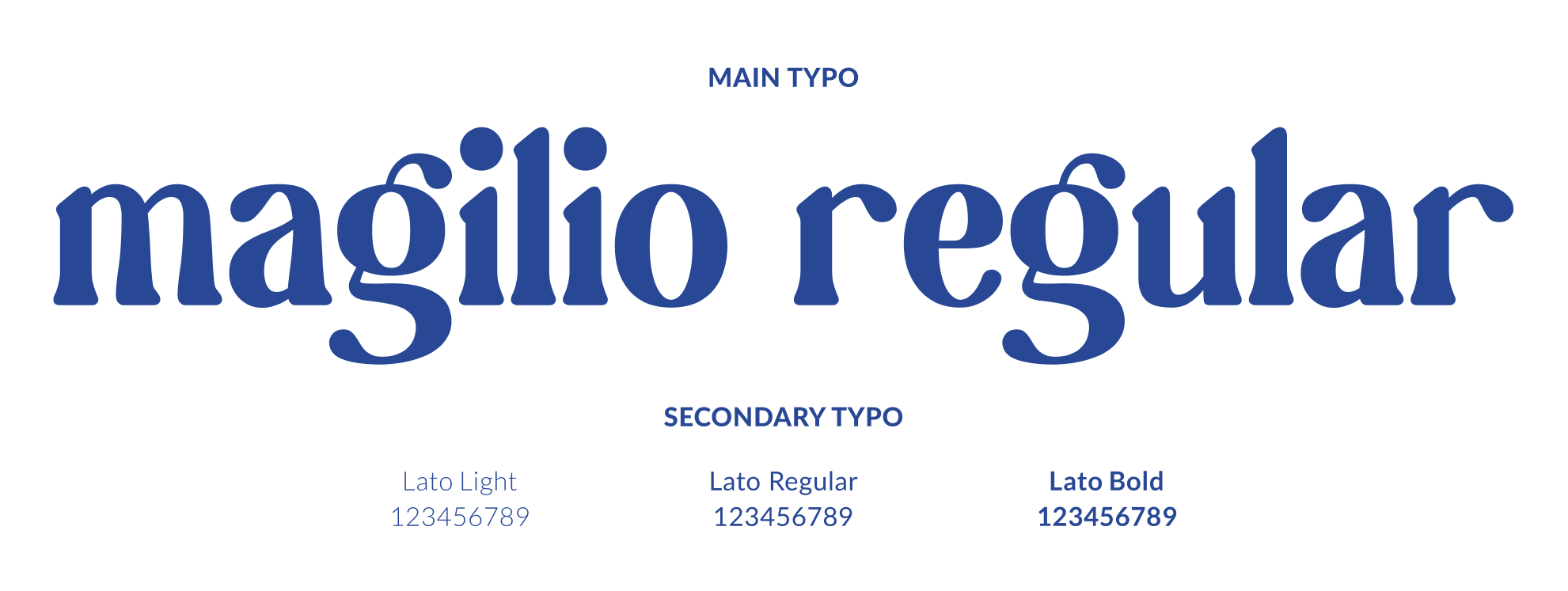
The bold color palette, playful typography and graphic elements were created to reflect the casual atmosphere of a modern beach bistro, giving the brand a personality that feels fresh without trying too hard.
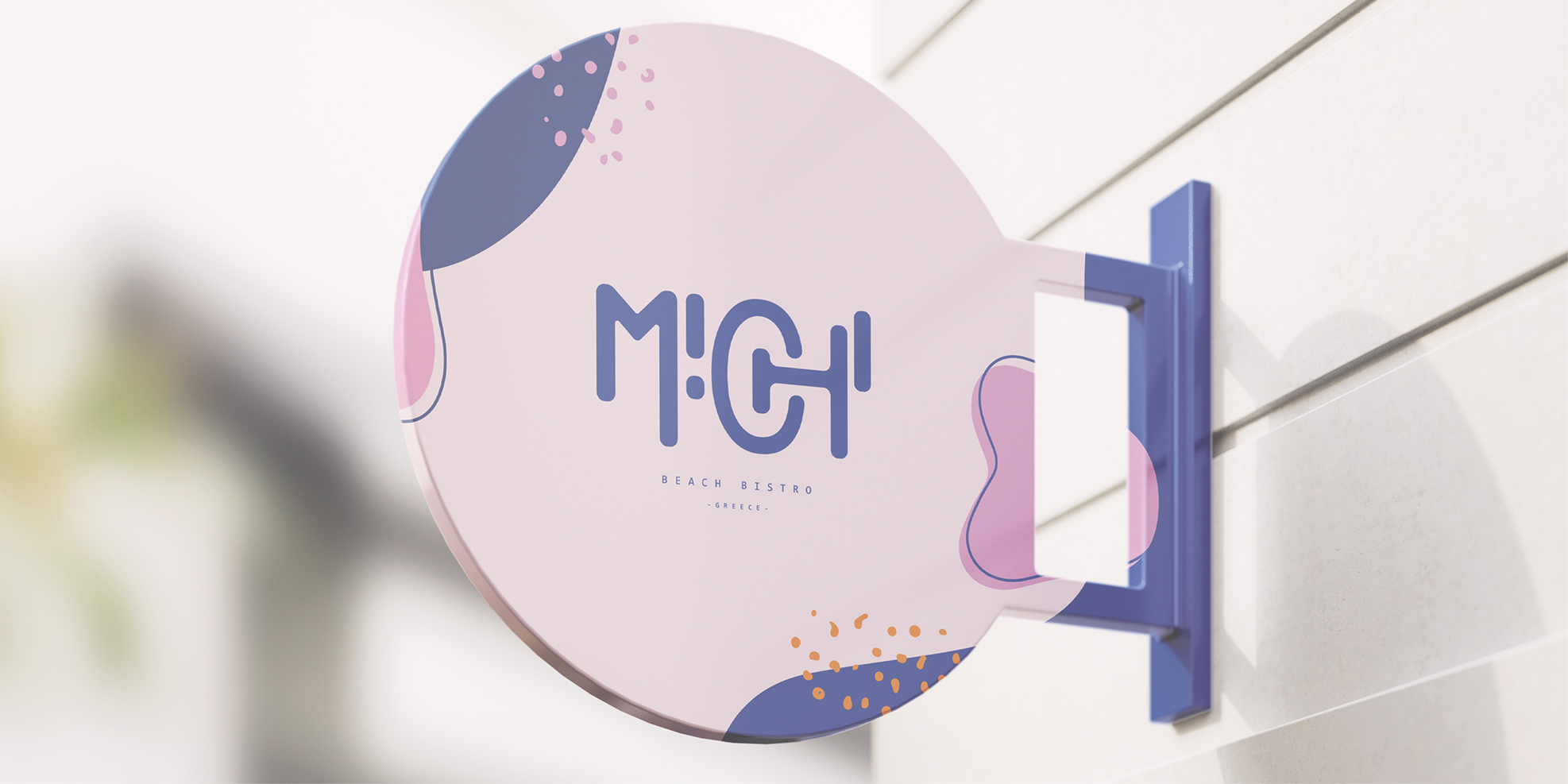
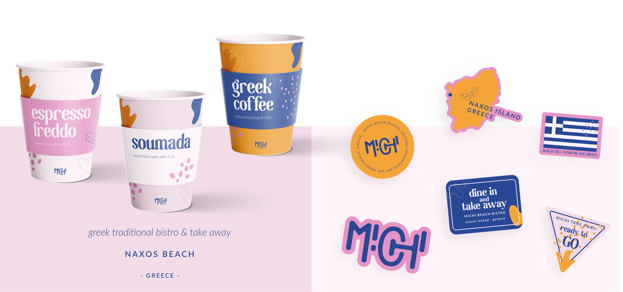
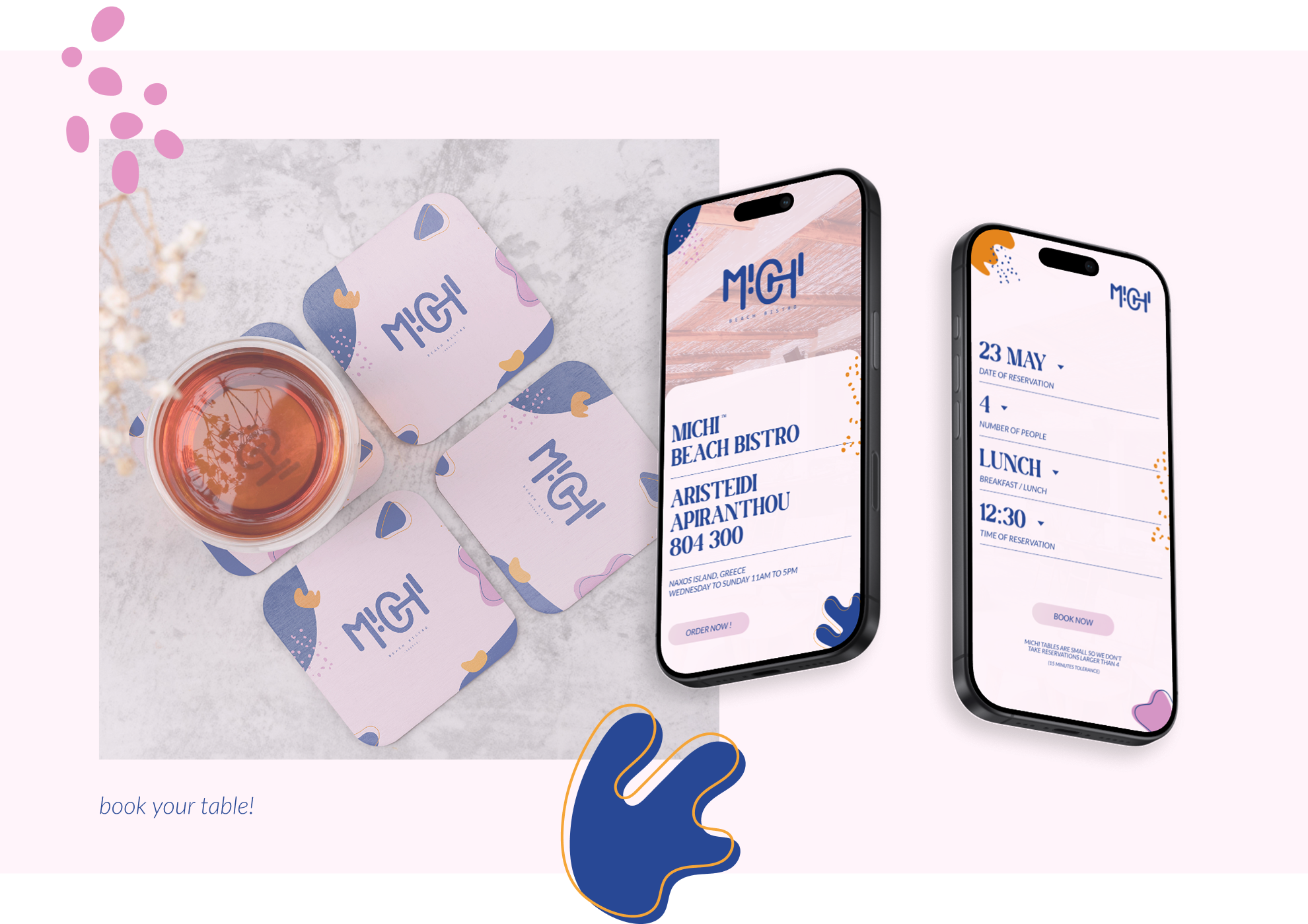
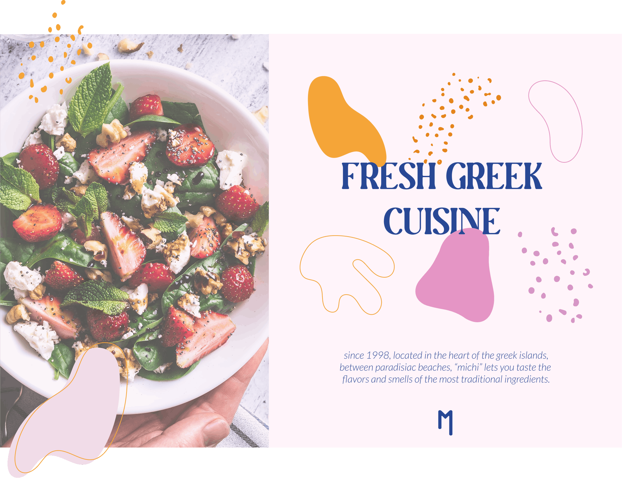
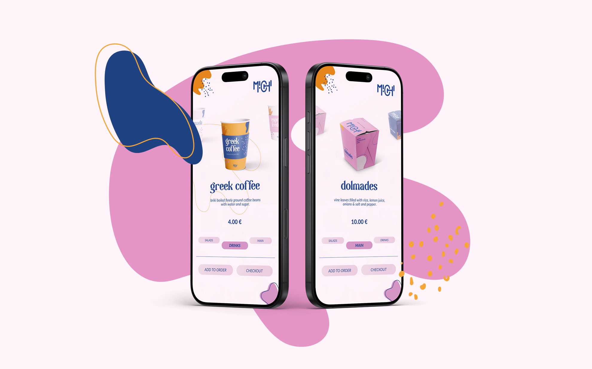
From signage and takeaway cups to merchandise and digital touchpoints, every application follows the same visual language while adapting naturally to different formats and situations.